Nowadays, the demand for property in Singapore is excellent. Unfortunately, not everyone gets the chance to own a spacious condo of three or more rooms. That shouldn’t be a problem with a condo interior design done right.
Perhaps, you might be wondering what you can do with a unit of around 50 sqm. The answer is “a lot”. Indeed, there are some standard methods to make a home look more prominent. What’s more, we’ll show you some ideas that you haven’t seen.
At first, you’d be surprised at how airy you can make your condo. Just eliminate the clutter and get a professional to help. In the nick of time, you’ll start living a simple and relaxed life in your tiny functional condo.
Unsure of which interior design style to go for? You can always check out the latest interior design trends such as Scandinavian design, and modern mid-century style. If you’re feeling adventurous, check out unique interior designs like Balinese interior designs, Colonial-Style designs, Industrial interior design and Warehouse design style.
Stick to the “Light and Bright” Mantra
Typically, you’d want to start from what you already have. However, dull and dark hues are less likely to work in small spaces. Therefore, you should consider optimizing your one-bedder condominium from this perspective.
In such cases, you’d want to pick white or neutral colours for your walls. Also, consider adding glass panels to replace the solid wall as a divider. That way, you’ll maximize the amount of light inlet throughout your interior.
Another important part of designing a small home properly is lighting. Many homeowners make one common mistake – using only one lighting source in each room. This often leaves dark corners, thus shrinking the visible area. And this makes your home look even smaller.
But hold on – it’s not that difficult to deal with this issue. Just make sure your rooms are well-lit. You can do this by layering lights – use a bedside lamp or concealed lighting fixtures on the top furnishing. Because you may not have enough surface space, you can use the walls and ceiling as much as possible. There are many different lighting hacks and you can get really creative to make your home look larger.
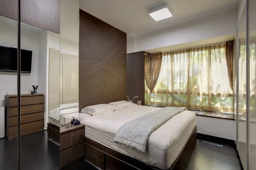
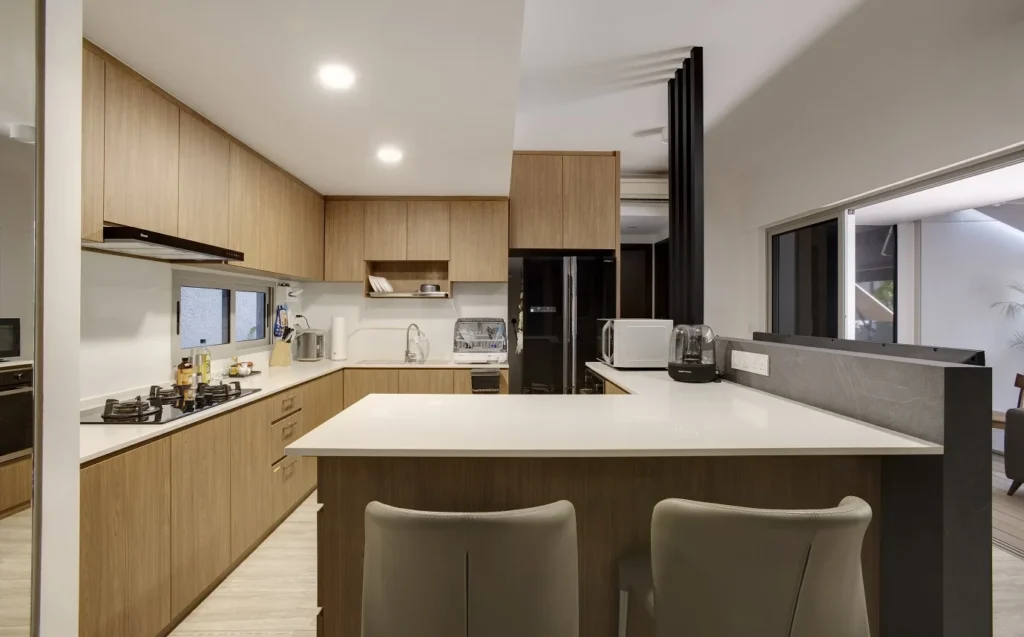

Brightly-Lit Living Room @ Sophia
Create a Clean-cut Home
First and foremost, when dealing with small spaces, you should go by the “less is more” rule. In other words, you should get rid of anything that’s rarely or not used at all. Stripping down the interior to the bare essentials will eventually open up more space. Moreover, you’ll be able to concentrate on the important pieces that you’re living with daily.
When you have limited space, your best move is to create the illusion of a bigger home. Perhaps, it’s not hard if you follow the rule of the clean-cut home. Implement some discrete space-saving solutions such as cabinetry with discreet finger pulls. What’s more, you can conceal your appliances to enhance the sense of cleanliness.
Implement a Pop-up Dining Room
If your condo interior design doesn’t allow for a dining room, implement a pop-up one instead. Besides, it’s a smart solution for residents who rarely eat at home. Therefore, a retractable dining table will be a useful amenity that would quickly disappear when not in use.
Get Tonal
Ask any interior designer, and they’ll tell you that walls and flooring are the first things you should repaint if you want to remodel your small home. Similar to the minimalist interior style, the best way to make a room look bigger than its original size is to use tonal colour palettes – bright, calming and soothing optical white, to be specific. Just make sure you clean the high-traffic areas because smaller spaces are bound to highlight the daily wear and tear.
Also, when going for light colours, make sure your home doesn’t appear too clinical. As mentioned previously, smaller spaces tend to start looking dirty faster than usual, so rubbing against the walls is also a huge no-no. Avoid incorporating patterned wallpaper because you can end up making your room look even smaller. Instead, you should stick to a same-colour design for your walls and flooring. This will nail a simple yet very efficient interior design for your small house or apartment.
Keep it Simple
While it may sound too general, this approach is essential for any condo interior design. Creating a warm and cosy feel that we all love requires a delicate arrangement of stylish furniture, art, and accessories. You can implement some quirky details like a raw brick wall, or a bold-coloured divider to enliven the tight space.
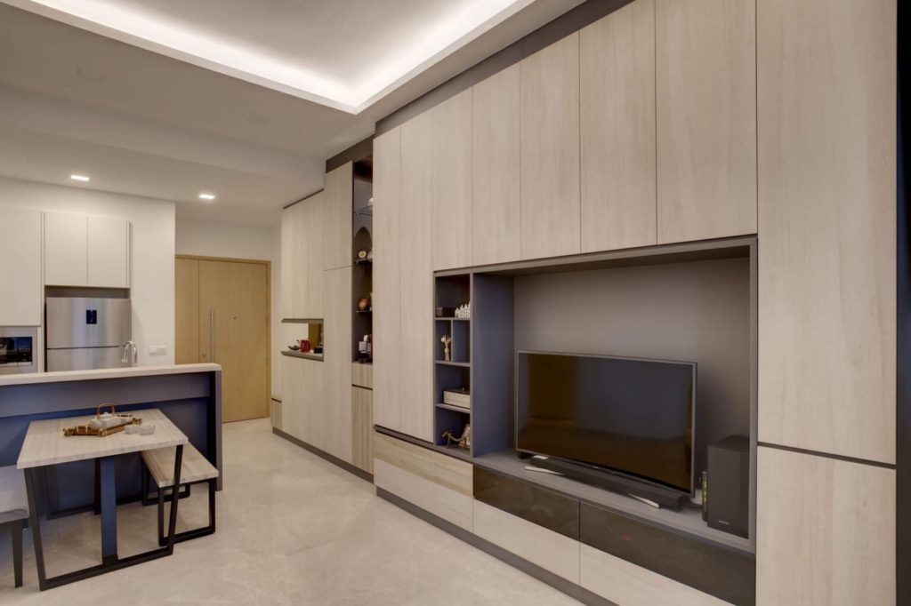
In The Mood To Dream @ Hillview Rise
Add Dark-colored Accents
Of course, most people would bet on a light colour scheme for tight spaces. However, that’s not a strict rule that we should all follow. If you’ve got a plan meticulously enough to work out a way with dark-coloured accents, do it. In turn, they’ll contribute to delightful contemporary aesthetics.
Mirrors
Using mirrors as a way to make your home look bigger is a good old styling trick. And it never fails. Using the power of natural light, you can situate a mirror adjacent to a window to reflect the outdoors. This will surely make it seem as if you have another window. Thus, making your room bigger. For this reason, you should have at least a couple of mirrors in your home.
Take Inspiration from Japanese Aesthetics
Perhaps, you’ve seen the now-trendy combination of pale wood cabinetry and light brown flooring. It pairs perfectly with some light-coloured onyx marble and modern Japanese aesthetics. Arguably, that’s an easy way to accomplish a serene atmosphere in your condo interior design. Also, you can use retractable screens or even Shoji doors to create temporary privacy in your open-plan area.
Include Hide-and-seek Elements
Similar to the discreet storage cabinets, you can include hide-and-seek elements throughout your home. That way, you’ll declutter your space and improve its functionality. Who doesn’t like sleek flip-open mechanisms that can unveil secret compartments effortlessly?
Hang Curtains Higher
Letting in natural sunlight has always been a hallmark of good interior design. However, hanging your curtains higher has little to do with this. Perhaps, this is an easy way to create a larger-looking and more impressive space. The dramatic floor-to-ceiling sheer curtains are bound to add to your spacious interior design.
Flush Storage Compartments to the Side
If there’s one straightforward trick to evoke an airy feel, it’s to flush the storage compartments to the side. Your condo interior design would undoubtedly benefit from sticking to this approach, as it would look more organized. Ultimately, you’ll have a vast amount of space to work on complementing your comprehensive look.
Built-in Storage Furniture
As the saying goes, “desperate times opt for desperate measures”. In this case, having a small home would require you to save every inch you can. Installing built-in seating with concealed storage areas is a genius hack that’ll relieve you from the constant mess around. As a result, your room will not look small and cramped anymore. Typically, armchairs with built-in storage are suitable for books, but you can also get your hands on a banquette seat with built-in storage – the perfect addition to a small kitchen!
You Need Extra Storage Space
As said previously, creating the illusion of a home looking bigger than usual can only happen when you get rid of everything unnecessary. On the other hand, you should bring extra storage furnishing where you can pack all the other goodies you’ll eventually need.
Bear in mind that this rule plays an essential role in the kitchen interior design where you can employ the walls to hang your utensils. You can also incorporate functional shelving as per need. Sliding storage compartments are an easy yet effective way to store stuff like wine bottles and smaller stuff like trash bags, knives and etc. We’ve already listed some other options for small spaces that may fit in your kitchen perfectly – Murphy beds, foldable chairs and so on. There are tons of options for a small space interior design. All you need to do is plan carefully what you’ll need and act accordingly.
Play With Scales
Scaling each item with the others can be a particularly tricky task, especially if you have limited living space. However, this is one of the main points that you have to bear in mind when remodeling or renovating your small home. Whether it’s lighting, foldable tables or curtains, you should make sure everything syncs properly. You can deal with scaling by creating focal points in each room. Just pick one or two large pieces of furniture and then layer the other items around them to keep the atmosphere rich and “eye-moving”.
Speaking of focal points, keep in mind that you should drift your furnishings towards the middle of the room rather than placing them all against the walls. This is a common mistake that leaves homeowners with their living space constantly looking cramped and uncomfortable. Don’t do that!
Go Vertical
If you’re about to apply the “less is more” rule to your home, you’ll have to consider maximizing your storage space. This includes considering the surfaces you may want to use. Just make sure everything’s organized so it doesn’t look off. Oftentimes, being short on space makes homeowners and interior designers really creative. For example, your ceiling can easily become a handy option where you can store stuff like pots and pans.
By doing this, you’ll be able to perform an extra declutter that’ll give you more room to maneuver. You can also replace your old bedroom with one that has storage underneath. Additionally, you can go for small shelving solutions above and around the door frames. Generally, you can put the items that you don’t use that often in the highest areas and those that you plan on using more frequently – in the lower areas.
Foldable Furniture
If you have the budget, betting on collapsible wall-mounted tables and desks is the ultimate space-opening feature you can get. Other than that, you can also look up some foldable coffee tables. They are easily manoeuvrable, and practical and can be stored away when not needed. If you’re comfortable with it, you can purchase a foldable bed. That’ll create a huge amount of floor space for the smaller guests. Besides, it’ll keep your bed out of the way during the day which will make your bedroom look much bigger.
Speaking of foldable furniture, you can also consider getting a couple of nesting tables. Instead of one large and clumsy coffee table, you can implement a few small but highly-maneuverable nesting tables. This is a clever interior design hack that’ll allow fast clearing-up of the floor space when you’ve finished with your morning coffee or tea. And since nesting tables are not such an expensive commodity, it’s safe to change them with new ones with a different style when you get tired of your old ones.
Use Sliding Doors
Last but not least, you should optimize as much floor space as possible. In this regard, you’d want to consider installing a few sliding doors. Swapping out your traditional swing-type doors is an ingenious way to use the otherwise unusable space behind your traditional door.
Moreover, a glass sliding door will work correctly with the idea of increasing the light inlet. As a result, you’ll create a bright and functional atmosphere. Most of all, you’ll love the sleek look of some of these elegant sliding panels.
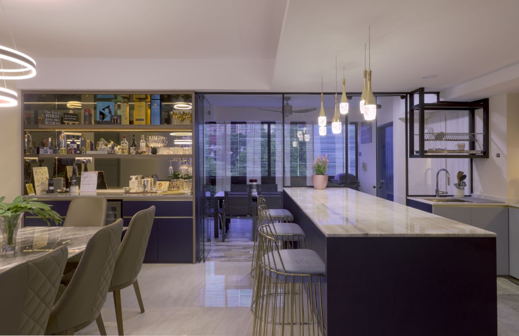
Sliding Doors In Living Room @ Faber Garden
Bring In a Large Rug
Just like the flooring and walls, rugs are also part of the interior design foundation of each room. For smaller rooms, adding a large two-tone or neutral rug will make your room appear bigger in an instant. On the opposite, smaller rugs often make rooms look smaller than they are.
Multi-Purpose
With everything being said, it’s safe to say that multi-purposing plays a major role in perfectly-designed small spaces. In fact, this is what small space interior design is all about – creating as many multi-purpose points in your house or apartment as possible. This not only opens up extra room, but you’ll also find out that you’ll become much more organized than before. All this comes from the simple mindset of making sure you don’t waste any space.
In this case, you can combine your workspace with your closet or top your laundry basket with a usable surface. There are many ideas and it’s all up to you to incorporate them into your interior design.
5 Oddly-Satisfying Condo Design Styles
Paradise in the City
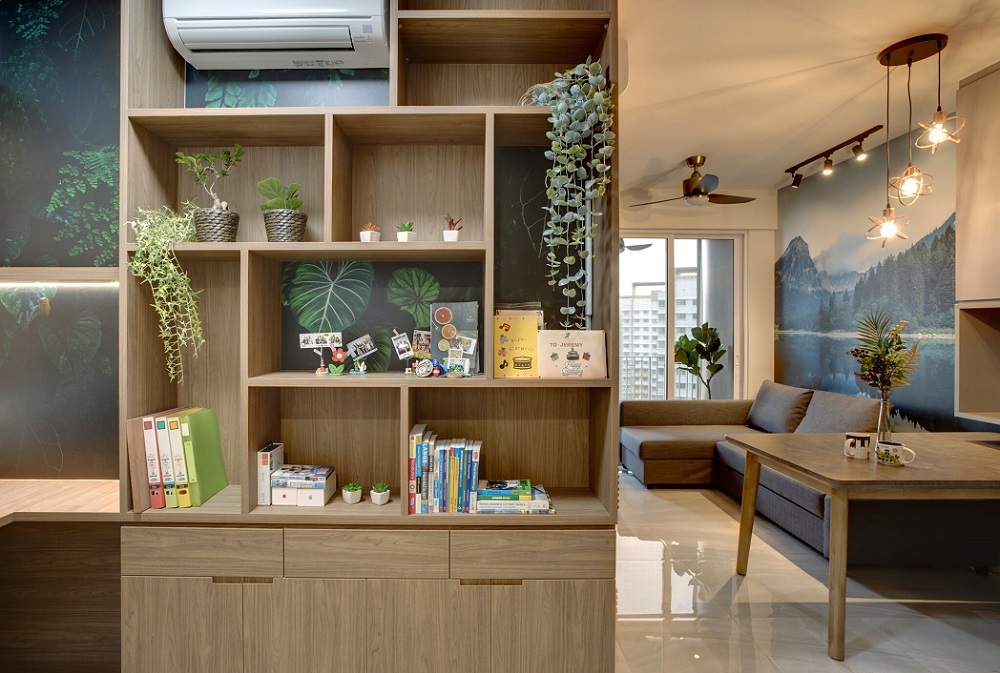
Para-Paradise @ High Park Residences
Arguably, there’s a hidden haven in the city, and it’s in the High Park Residences. This tiny condominium greets you with lush artificial greenery and light brown and white tones. As you enter, the living room awaits you with its large wallpaper of a scenic mountain view. On the opposite, there’s a TV with a feature wall of decorative plants.
Perhaps, the naturalistic feel flows from all aspects of this condo’s interior design. At the same time, it’s not too overwhelming. As we can imagine, the concept behind it is to infuse a stress-relieving value into the interior. Moreover, everything adds to the aesthetic value of the tiny condominium. After all, who doesn’t like to take a rest after work and spend quality time at home? Here, the calm ambience will undoubtedly help the residents achieve that.
Of course, the floral theme of the home wouldn’t have the same impact without some earthy cabinets. The interior employs different tones of light brown and muted grey and white tones to create a subtle contrast. The onyx-white tiles reflect the warm lighting to complete the inviting feel. In some sense, everything creates an illusion coming from the beautiful mountain wallpaper at the back of the couch.
Rustic Cotton Candy
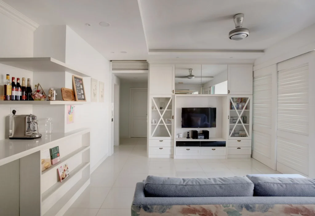
In this condo interior design, there’s something deeply satisfying. If you’re looking for a style to remind you of the old times, this is it. Surprisingly, the designers have managed to interpolate the owners’ taste in a breeze. The country-style look blends perfectly with some classic Nordic elements. Perhaps, this design is all about visual intricacy and detail.
Here, the white tones are prominent, and you can find them throughout the 1200 sqft project. There is plenty of storage space around the home. Also, there are a lot of surfaces mindfully displaced to accommodate the contemporary appeal. The pinpoint of the design is that it builds up around pre-existing furniture. Still, this idea blends in perfectly with the new style of the home.
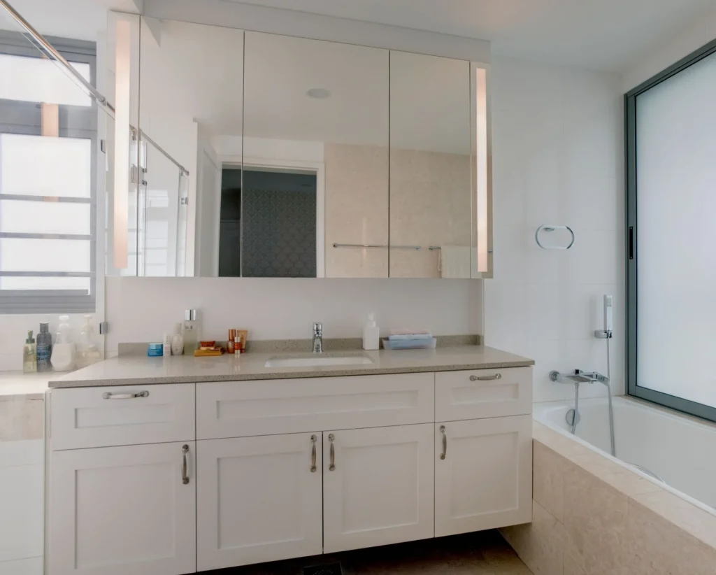
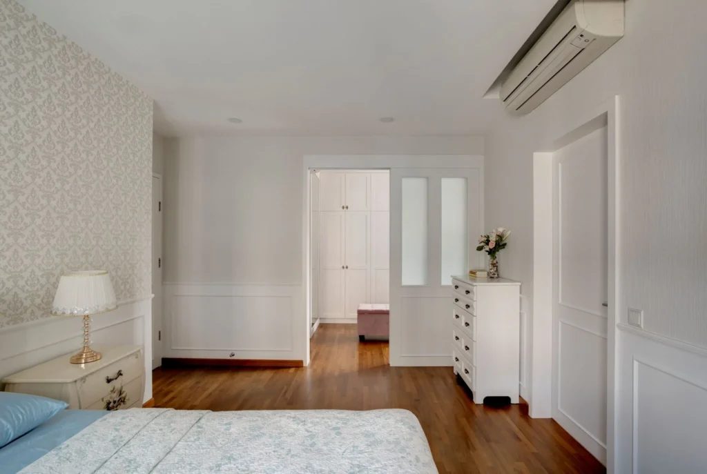
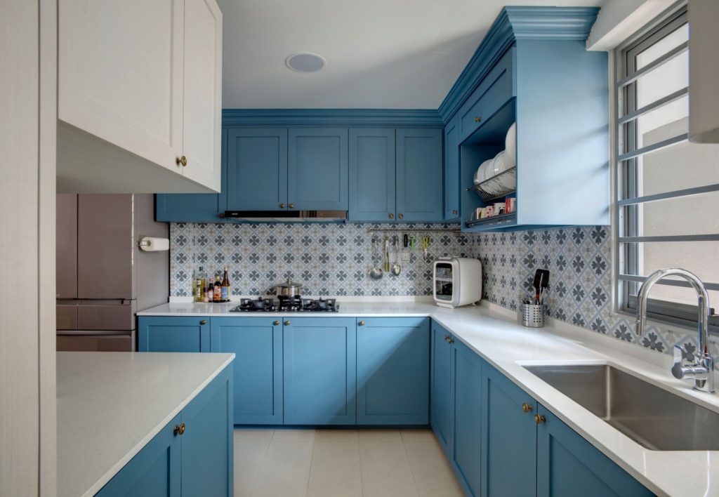
Of course, let’s not forget about the functionality that this condo interior design has achieved. When you enter the kitchen, you’ll see the transition to a vibrant space with soothing blue cabinetry. As expected, there’s ample room for all kitchen amenities. For more kitchen interior design ideas and how you can maximise efficiency, check out our blog post.
Soothing Blue Cabinetry @ Waterfront Wave
However, nothing can compare to the built-in wardrobe. The all-white piece of furniture can comfortably accommodate the entire amount of clothing and accessories.
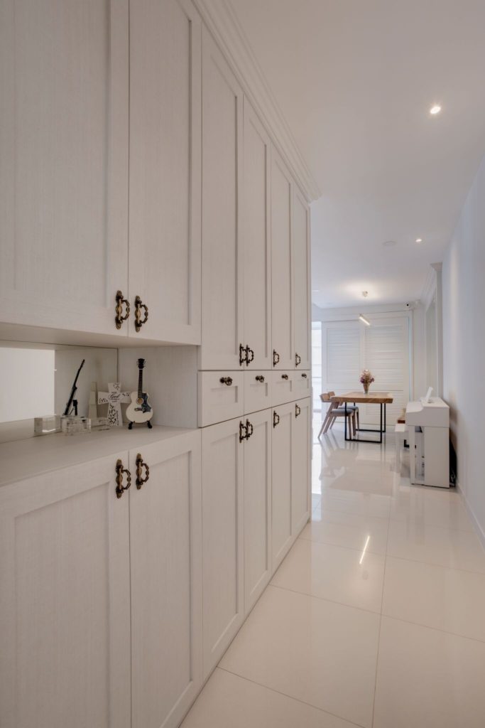
White Built-In Wardrobe @ Waterfront Wave
Sometimes, there’s no need to overthink things. The recurring elements between the premises aren’t that special, but the overall cohesion between them is. The colour palette ranges from white to light blue and Victorian blue. Besides, there aren’t many statement pieces to showcase. Instead, there are small details that retain elegance and improve the visual appeal. In this respect, these details are the mirrors, cabinet handles, and glass casings.
Looking for more rustic interior designs? You can take a look at our article for more inspiration.
Confident Luxury
If you’re into that elegant, upscale look, our designers have already done it. In the 1300-square-meter home at Sophia Residence, you’ll find the perfect template for posh condo interior design done right. The neutral woody brown and grey palette dominates the atmosphere creating a sense of subtle luxe.
What’s more, you’ll see varying tones of dark, light, and pale that complete the overall look. The ceiling lights create an easy-flowing transition of light across the premises. As a result, the designers have achieved a seamless unification. When you think of contrast, the kitchen countertop, furniture texture, and material are enough to set the boundaries between spaces.
In this three-room condominium, you’ll indulge in relaxed and understated luxury. The first and most immediate feature is the living hall space. It integrates the kitchen, hall, and living room in one open-plan concept. If you’re considering an open-concept kitchen design for your home, check out this blog post. Contrary to what you’d expect, the compartments discretely hide clutter. Also, there are lots of mirrors strategically disposed to open up the interior. After all, confidence comes from a strong sense of identity, and details play a major role in creating it.
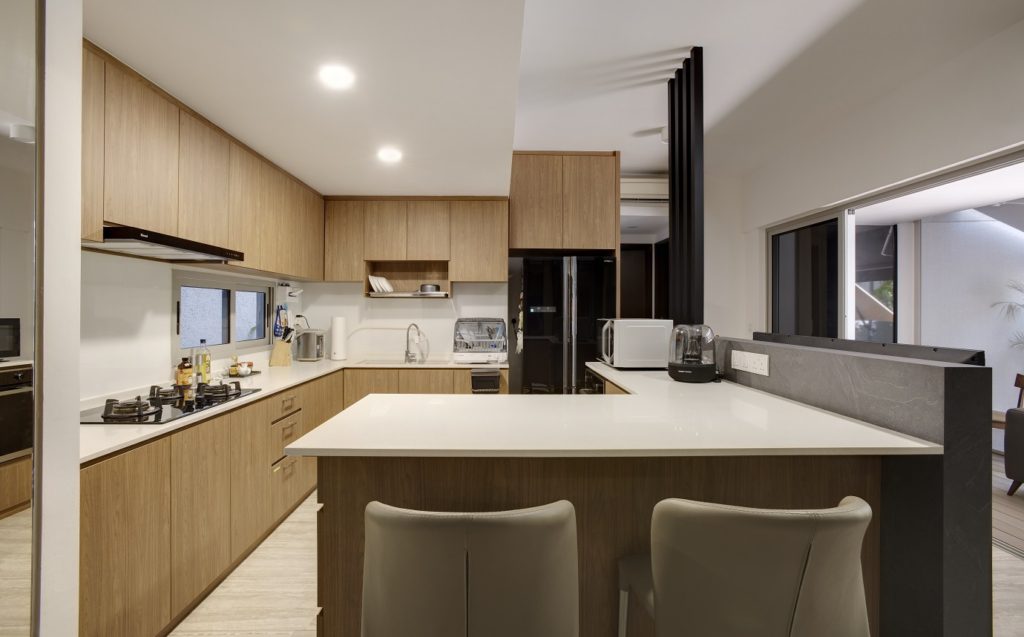
Luxurious Kitchen Look @ Sophia
Modern Retreat at The Peak
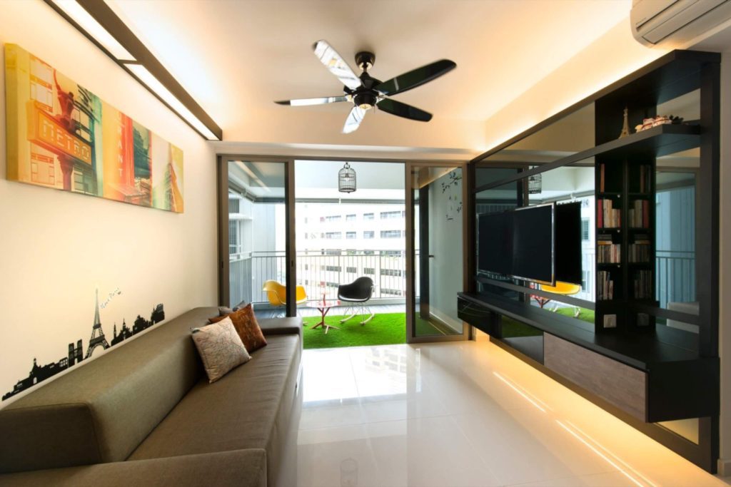
Modern Retreat at The Peak @ Toa Payoh
Perhaps, you’ll like the idea of making your home feel like a chic retreat. In this case, the Modern Retreat condominium interior design draws inspiration from the authentic style of chic Parisian cafés. Of course, that wouldn’t work without achieving a spacious atmosphere in the 91-square-meter condominium.
Overall, there’s a carefree vibe that floats throughout the premises. At first, it will make you think that you’re in an actual café. Indeed, the entire place will flood you with different depictions of the Eiffel Tower and other geographical features. Moreover, there’s a brick wall positioned right in front of the entering guests. The combination of the Tower and the brick wall will put you in the mood right from the entrance.
In the hall, there’s a light-wood dining table with two long benches facing each other. Three distinctive black lights complement the avant-garde and quirky look of the interior. Here, you’ll see a variety of materials and colours. For example, there are café chairs in black, red, and yellow. Moreover, the decorative elements are predominantly brown and orange.
The result is a condo interior design with glamorous undertones of Paris’ streets. They fill the home with warm colours and different shapes. While the walls remain mostly clean, there’s still a play on colours. Apart from the bright-coloured imagery in the hall, there’s a large, black TV set. It pairs perfectly with the chrome black ceiling fan. Arguably, one of the highlights of this interior is the carpet grass on the balcony. Just push the sliding door aside to get a breath of fresh air. After all, who doesn’t want to indulge in this Parisian atmosphere to recharge their mind?
Reader’s Favorite Functional Condo Interior Design
Located at River Isle, this 91-sqm condo evokes the “less is more” mantra right from the entrance. Wes has created a dreamy-bright ambience that subtly reminds a profound sophistication. Of course, the contemporary industrial style of this condo interior design has some unique features to inspire you.
First, you’ll notice the easygoing monochromatic selection of neutral colours. Apparently, you can find variations of white and grey to dominate the interior. As for the materials, the cabinetry and surfaces employ various layers of brown wood finish. Along with the light gradient marble flooring, the design exudes a feeling of cozy airiness.
Arguably, the most immediate feature of this condominium interior design is the clean-cut scheme. There are barely any shelves to see. Instead, the ample storage hides discreetly in the myriad of cabinets. The only thing left unprotected is the elegant island bar in the living room. It packs considerable storage space and doubles up as extra table space.
Apart from the sense of simplicity, there are a few statement pieces to like. For example, you’ll love the modern wood ceiling fan. What’s more, the designers have made sure the island bar stands out from the rest of the interior. In turn, they’ve created a set of accent walls, and one of them is behind the bar. Furthermore, there’s a visible emphasis on the vertical space. Thanks to the dim white glowing light features, the interior induces the illusion of greater size.
Perhaps, there are many other functional alterations. For instance, the kitchen employs a sleek glass sliding door for optimal kitchen space. All in all, there’s a harmonious ensemble of matching colors throughout the condo interior design. If you’ve been looking for sleek functionality, it comes in a warm minimalist atmosphere and a lovely island bar.
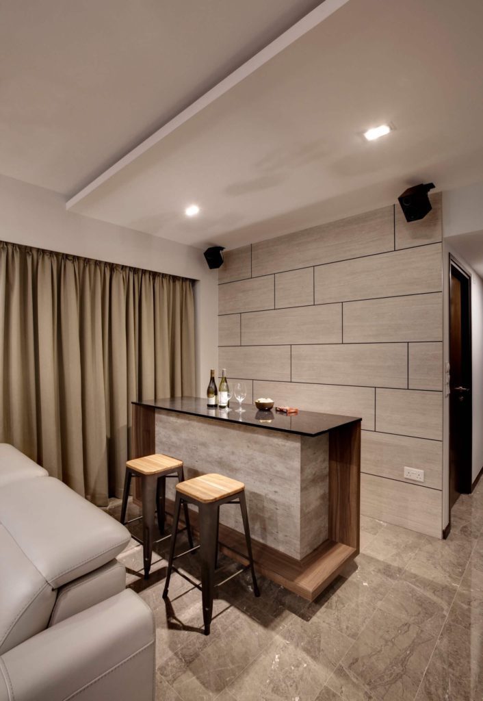
Sophisticated Simplicity @ River Isles
For more condo interior design styles, check out our numerous condo projects.
10 Do’s And Don’ts When Renovating Your Condo
1. Do: Choose The Right Colors
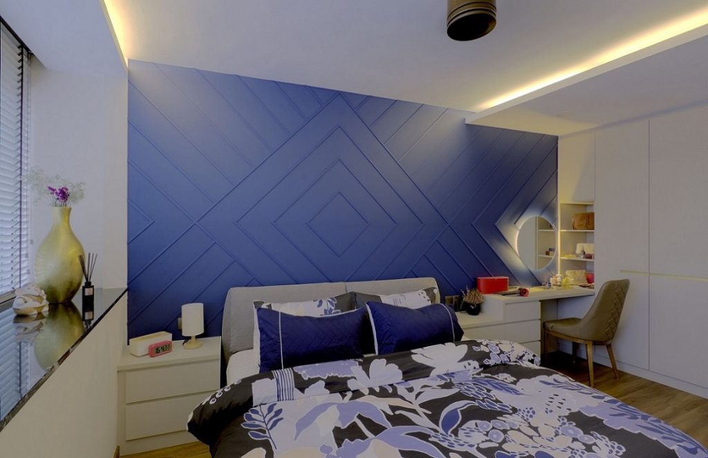
Choosing the right colour for each room is very important in enhancing its outlook. A small room needs to be designed in the right colours to make it appear spacious and airy. For example, hallways should be kept neutral to give a light and airy appearance. The living room should also be designed in light and pastel shades to give a bigger and more spacious appearance to the house. Deep green and shades of blue look beautiful in a bedroom as they give a very comfortable and cosy outlook. This is what has been done exactly in this bedroom at Faber Garden where the royal blue wall gives a very dramatic yet comfortable effect.
View these articles if you’re looking for more living room design styles or design ideas for your bedroom.
2. Do: Group and Organize
When you are decorating your condo, try to group things and organize them in groups instead of scattering them all around. Group similar elements together either based on colour, functionality or other factors. This helps bring about cohesion and consistency into the design and makes it appear less cluttered. For example, if you have three paintings that are somewhat similar to each other, place them all together on one wall as a group instead of placing them on different walls. Décor items can also be grouped similarly. You can then use various lighting methods to highlight those groups which will create a dramatic and wow effect.
Take the example of the living room at Sims Urban Oasis. The photographs have been placed in a group on one wall while all the remaining part of the wall remains unoccupied. This creates a great visual outlook and keeps the area neat and sleek.
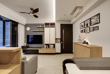
3. Do: Mix Warm and Cool Colors To Create A Pop
Many times, people try to use just a single colour theme for a room which creates a dull and monotonous appearance. To correct that, mix and match colours. Use warm and cool colours together to create cohesion and elegance in your condo. You can use cool or warm colours for the general theme and add one element with different vibrant colours to help bring everything together.
This can be seen in the following image of a room at Toa Payoh. Here, you can see how the vibrant paintings on the two walls help bring the cool elements of the room together to create a pop and vibrant atmosphere.
4. Do: Use The Height
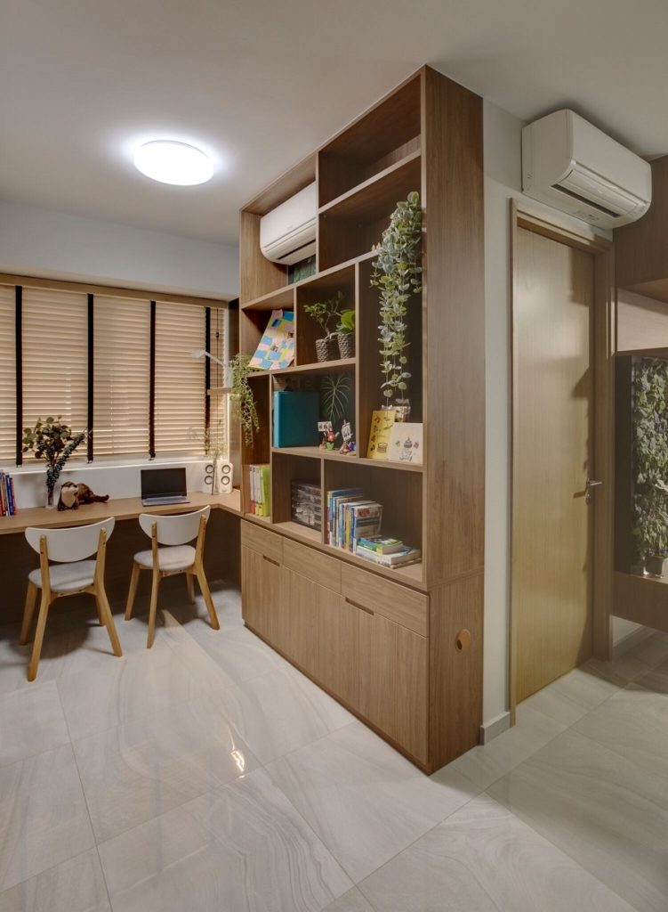
Most times we fail to utilize the height of a room by keeping all cupboards, shelves, furniture, and other elements of medium height. However, using the full height of the room for certain elements creates a stunning effect. It also helps to create more visual space in the room while giving me more storage areas. Of course, you should not go overboard on it, rather try to use it for just one wall of a room. This can be incorporated into a full-length shelf of books or other decor items.
This can be seen in the following design at High Park Residences where a full-length shelf is used to display books, plants, and other decorative items.
5. Do: Incorporate Hidden Storage
One of the best ways in which you can transform the image of your condo is to reduce clutter as much as possible. Since in a small condo, you may not have enough storage space to store all your extra items, it is a good idea to incorporate hidden storage that doubles as other functional items such as a table, sofa, or bench. It will provide you with a lot of new storage space as well as make your condo appear neat and clean.
6. Don’t: Match Everything You See On The Internet
When you look at different design portfolios on Pinterest and other websites, don’t try to match each and everything from there. Your condo should be a place that you not only feel comfortable in but has a unique character based on your personality and liking. Choose elements and designs that are cohesive. Don’t use similar colours too much in a single room which will lack consistency and cohesiveness. If similar colours are being used, add different coloured trims and borders for those elements to make them pop and appear different from each other. This will help in opening up space and adding a different character to your interior design.
7. Don’t: Use The Wrong Proportions
Choosing the right size of furniture and other décor items is very important to avoid visual clutter in your condo. If you have a spacious room and you put a lot of tiny furniture pieces, it will make the room appear quite cluttered. Conversely, if your room is small and you put just a few very large-sized furniture items, it will again make the room appear cluttered and cramped. Based on the size of the room, choose items that will complement each other not just in colour and design but also in size.
Consider the following design at Sophia Residence where space has been beautifully utilized by choosing the right size and number of furniture items.
Living Room Design @ Sophia Residence
8. Don’t: Save On Lighting
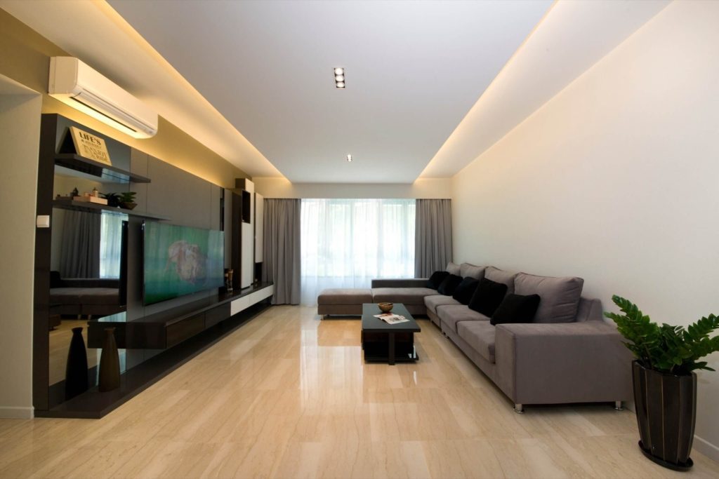
This is probably the most important thing that can entirely make or break the appearance of your condo. No matter how beautifully decorated and designed a room is, if the lighting is poor or inappropriate, it will fail to impress anyone or give the effect that it was intended to deliver. By using different types of lighting, you can highlight areas of your room that you want special attention to. Using recessed and track lighting, you can create a dramatic yet cosy environment in your condo.
This can be seen implemented in this exquisite design at Butterworth View, Katong. Notice how the different types of recessed and accent lighting help create a soothing environment where all the elements in the room are highlighted in a subtle manner.
9. Don’t: Save On Upholstery And Rugs
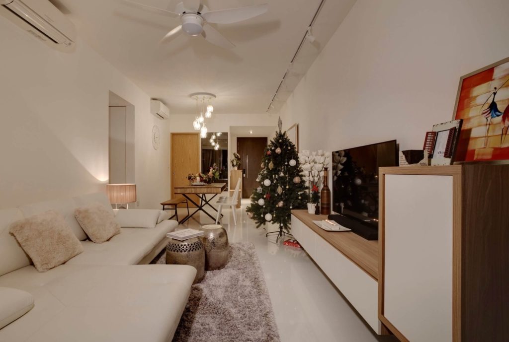
One way you can completely transform the appearance of your condo is to invest in some good upholstery and rugs. Do not save on these items since they last a long time and play a pivotal room in uplifting the appearance of any room. Using plush pillows, cushions, and rugs in any room will completely transform its appearance and make it look more elegant and luxurious.
As an example, consider the following room at a small condo interior design project at Parc Olympia. The plush cushions and luxurious rug help in making the condo appear much more stylish and vibrant.
10. Don’t: Stop Until You Are Happy With The Results!
Lastly, don’t stop implementing these and other ideas in your condo unless you are completely satisfied with the result! Use these tips as well as other design options to find the best match for requirements and comfort.
Your home should be a place where you can relax and unwind in an atmosphere that is far away from the stressors of life. Hence, it is only natural that you would want it to be a welcoming and comfortable abode. By keeping in view all of the above-mentioned do’s and don’ts, you are sure to come up with a design that suits your needs as well as offers a comfortable, elegant, and cosy environment for your condo.
Embrace Functionality with a Condo Interior Design
All in all, there’s a lot to see in a small condo unit space. While many owners give up on the idea of creating expressive designs, tiny spaces can really boost your creativity.
Achieving a well-designed interior can significantly improve both the look and feel of your home. Whether it’s a sleek and modern interior design for a condo, a practical yet stylish HDB licensed interior design, or a sophisticated landed house interior design, our team has the experience to bring your vision to life. We also provide customised interior design for those with businesses to suit your professional needs in Singapore. For tailored solutions, discover our insights on residential design, commercial design, and the latest interior design ideas to transform any space.
Besides condo, we also provide designing services for HDB BTO flats (3-room HDB designs, 4-room HDB interior design, 5-room HDB designs) and landed property interior designs.
