91 sqm
Sophisticated Simplicity @ River Isles
Project Details
Location:
River Isle, Singapore
Site Area:
91 sqm
Duration:
6 weeks
Client & Brief
Sometimes, less is more. Smaller details can be emphasised, the grand scheme of an interior can be highlighted and an ambience of sophistication can be established when a design encompasses clear direction, consistency and an unmistakable style.
This charming abode located in Punggol, Singapore, has checked all of the above and more…
The occupants of the home (a newlywed couple) had communicated their preferences to Dolly, the designer in charge of transforming this space.
This charming abode located in Punggol, Singapore, has checked all of the above and more…
The occupants of the home (a newlywed couple) had communicated their preferences to Dolly, the designer in charge of transforming this space.
What We Did
The couple noted that an industrial contemporary style with ample storage and a user-friendly kitchen space were at the top of their priority list.
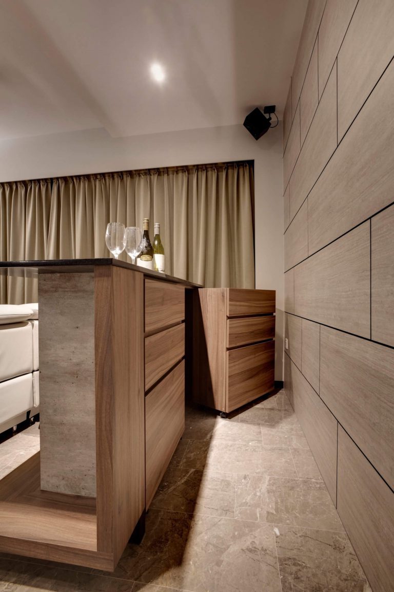
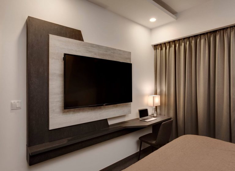
Dolly went with a wide spectrum of neutral tones to set the pace for the rest of the theme. Layers of brown wood finish can be found throughout the home, applied on various cabinets and surfaces.
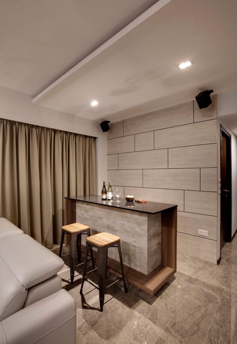
The incorporation of light gradient marble on the flooring and a sturdy living room island bar counter top just behind the sofa, adds elegance to the space and, upon the occupants’ request, additional mobile storage has been included at the island bar counter to double up as a hidden compartment that reveals extra table space when needed.
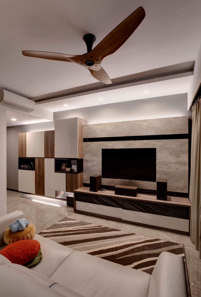
Innovation is a part of many of the home’s sections and, while maintaining an air of simplicity, certain unconventional fixtures have been implemented throughout the home. These include a modern wood ceiling fan that acts as a subtle focal point in the living area and a TV console that’s wrapped in contrasting light and dark hues.
Accent walls such as those found behind the island bar or television serve as aesthetic keys throughout the home, which consequently leave much more room and create a spaciousness that doesn’t leave the sections feeling too barren. A good amount of focus remains on the vertical premise which ensures that the horizontal aspect of the abode is left almost untouched. This accentuates the illusion of greater size within prominent areas.
In order to emphasise the home’s height, lighting fixtures that hang from the ceiling or take too much space have been avoided and, instead, lighting has been incorporated in the form of rows. In addition, dim white glowing light features have been built into the living area’s corners to allow better visibility where needed.
A few more adjustments have been made to the kitchen. The original casement kitchen door was replaced with a sleek glass sliding door for an optimised kitchen area that brings usability and functionality to the forefront.
Overall, the combination of elements that have been so meticulously hand-picked by the designer, produces a harmonious ensemble of matching colours and clean spaces, setting a lovely minimalist theme for the home.


